A note on my books. Can they stand alone? Do you have to wait for Three for satisfaction? How finished or unfinished is the story?
Answer: One and Two are whole books, with a conclusion to the events in them, and the themes tied up. Read One, and you’ve reached a finish. Read One and Two, and you’ve reached a finish. As for me, if I’m smashed by a bus today, I’ll be upset that I haven’t gotten to tell you my ideas on Temujin’s later life; but I, too, for my comfort, know I have reached a finish.
My instincts operate this way; I wouldn’t myself write an unfinished book, and very far from leave you with a cliffhanger, I’m concerned to give us both closure. I think you’ve a right to insist on that at the end of six hundred pages, and I have no excuses, I’ve had space to see my story and my themes out to an end. [There is a footnote to this. See footnote.]
Also, I want to be free for the next. The next has different demands, and I need the freedom to meet new questions with new answers. Each of my books has a different style — at least to my eyes, which may be hyper-sensitive. It’s a big thing for me about how Temujin changes, how life changes for him, and I’ve got to have an elasticity to capture that.
Footnote
So, what about the sections I’ve issued? Are they finished books? I’d say, #1 Of Battles Past, #2 When I am King and #4 The Sheep from the Goats — yes, these are books in themselves. Only #3 Me and Atrocity I don’t call a book, and I’m dissatisfied with the situation there… a casualty of publishing. By great fortune, The Old Ideal split neatly into halves, both in size and subject; less fortunately, Tribal Brawls had to divide into a third and the other two-thirds. What’s worse, I stuck a facetious title on: Jamuqa must have named Me and Atrocity.
Whenever you pick covers, there are those you almost chose or wish were possible to you. So I just have to exhibit a few great images I didn’t use.
For a book titled ‘The Sheep from the Goats’ and to do with Mongols, the above was an obvious resort. It’s quite famous: painted by a Zhao Mengfu in the Yuan Dynasty (that’s the Mongols in China), it’s thought to be a comment on the question, whether or not to work for the Mongols. There were Chinese scholar-officials who refused to serve under the Mongols and kept an ivory-tower aloofness; others argued for useful service, yes, even with barbarians in charge. After ten years in the ivory tower Zhao Mengfu agreed to join the court of Khubilai Khan, and defended his stance against the criticism of peers. His stout, stuffy sheep feels lofty next to his combative, more energetic goat.
Another goat I found – in case you’re keen on goats. Here’s a totem-style Yule Goat from Gotland, an 18th-century farm now a museum.
Getting away from goats. When I began to think about animalistic masks, I found this Swiss carnival mask, in the Museum Rietberg, Zurich.
It’s great, but we went to Africa instead. I’ll have to post on the African masks, but it’s a subject new to me.
And here’s what else I found on David with the head of Goliath:
A second Caravaggio
A Titian
And one by a certain Valentin de Boulogne
I did notice, on my search, most Davids were too dainty, too fastidious to touch the head, never mind haul it by the hair, as Caravaggio’s does: they posed beside it with their hands off. Caravaggio, of course, knew about the seamy side of life, wasn’t a stranger to blood. No-one else even thought to try an expression on David’s face like to my chosen Caravaggio.
Still on text placement, do your own. With special attention to climactic passages. It’s wonderful how a space, inserted where convenient and unnoticable, that merely shortens a line twenty lines above, gives a new page break which – in the drama of the moment – functions for us, either holds a line back, keeps a paragraph whole, and the sense leaps out unobstructed, undiffused. It’s like poetry, your line and your word placement in poetry.
With paperbacks, you can arrange your text on the page, for the sense. I can set out my sentences, by quietly juggled spaces, not to sprawl sloppily or lurch from page to page, cut in half or quartered where we don’t want an interruption — I can make that brief gap when you have to turn the page, suit or run smoothly, even hide a spoiler. Every page handcrafted, by me, for your experience of the book.
My paperbacks, and my text layout, I don’t doubt, have an indie feel. But that includes lines set out by the writer, with an eye to content, not just neatness.
I seem to have high, high threshold for those unvetted ebooks that come equipped with grammatical gymnastics, slips of the finger, and creative spellings. Notice how fond that sentence was?
It’s an issue that puts a lot of people off the indie publishing lark. A great excuse has leapt to mind, about my toleration factor. From an early age I have stumbled through medieval literature, unmodernised. I loathe modernisations. (If you want to know why, just read the first four lines of Canterbury Tales in Penguin’s modern English translation, and then read them in Penguin’s original-spelling edition. See?) I had the commonsense – which I must have learnt, possibly from T.H. White, or T.E. Lawrence? – to loathe modernisations from the start, so I pitted my teen brain against original-spelling Malory and onwards into the wonders of medieval romance.
As for genuine Malory, may I pose the question: do you like your knights garnysshed for battle, or… come to that, I’ve only eyed moderns to scorn them and don’t have one in the house. What do they do? Garnish Sir Lancelot for joust? I bet he prepares, doesn’t he, or arms himself: and how much is lost?
Or I’ll give you the serious argument, although this is a tangent. Yes, the original is odd to our eyes. But that is a constant little memento to you: throw yourself back, do not make your modern assumptions, question them – at every sentence, watch for the 15thC ideas of the world, and don’t judge by your own. Else you read the book half-blind. The ‘simplest’ change – removal of the garnysshynges – starts to remove the evidence, in this case, on their idea of battle, that’s different than ours, in subtle ways you need the words to study. If you want to know how a knight felt in his battle preparations, Malory can tell you, but a moderniser won’t.
Where was I? Ebooks. After these encounters with spelling and grammar different from our own, and yet English, can I mind an ebook? The grammar and spelling taught to us goes for here and now, but English has been a Beast Glatisant with head of pard and feet of hart, and Chaucer, he’d be kicked out of grammar class today. It’s English, he might protest on his way out. If I can understand it – this is the bottom line – it’s English, and even to have strictures on how to spell a word is latter-day in the wonderful life of English. Is this why I don’t care?
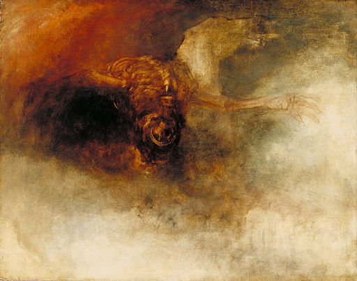
Since the artwork for Two is decided beyond negotiation, here we are. This is Turner: Death on a Pale Horse.
Nobody can talk me out of this one. Too grisly for a first book, I admit, but Two is where Stuff Happens. And there’s a death at the end of Two (no spoilers) – this picture is talking that death to me. My sister understands me. The white horse heads upwards, the carcass a load on his back, and… you know. The carcass is just carcass, but the horse?
Helmet Lad. Giotto, amongst the crowd in a crucifixion scene, paints a soldier with a band of pseudo-Mongol script about his helmet. Go figure.
This lad has the feel of Temujin if not the features. Temujin spends much of the book in a pother about his head wear; and the weight of kingship sits heavily upon him. There’s Jamuqa’s trophy helmet too, though that’s teardrop shape, black iron smoothly damascened with gold dragons in flight. Description of a real helmet – I’ll give you that one later.
I’ve driven my sister crazy with possible covers for the first. But we have a winner: Delacroix, ‘Tiger Attacking a Wild Horse’. This is so similar to steppe art I’m astounded. I can guarantee they’d have loved this.
Fighting animals were always a topic:
Fourth from the trunk was one of those thousand-year-old themes: The War of the Animals. “Here’s a hard one.” It was life on earth as a grim struggle, animals pitted one against another. In an abstraction, a distillation, they were coupled as you like, they didn’t have to be enemies, and griffins and rocs were included. The scene was after a hand-to-hand scrimmage in battle or a melee in wrestling, no space left in the jostle; and in each distinct fight neither opponent unambiguously winning, but locked together by tooth and claw and horn – eagle and tiger, argali ram and snow leopard, wolf and unicorn impaled, imprisoned each other. Most of their visages were turned outward, grisly and awry. “Do grizzled old warriors stand in front of this and say, I have often felt life is like that?”
Here’s an anatomy of the ideal horse, from steppe epic:
His nostrils quiver as briskly as the gills of a fish; he has a hare’s haunches, a weasel’s spine, legs from the gazelle; the crest of his neck he arches like the peacock; his head a serpent’s head, dainty and neat and erect.
This fellow is also blue. Slightly blue, and I’ve noticed a number of blatantly blue horses in steppe art. We do have several blue roans in the story; Temujin’s fond of blue roans.
This site uses functional cookies and external scripts to improve your experience.
Privacy settings
Privacy Settings
This site uses functional cookies and external scripts to improve your experience. Which cookies and scripts are used and how they impact your visit is specified on the left. You may change your settings at any time. Your choices will not impact your visit.
NOTE: These settings will only apply to the browser and device you are currently using.


 A note on my books. Can they stand alone? Do you have to wait for Three for satisfaction? How finished or unfinished is the story?


")